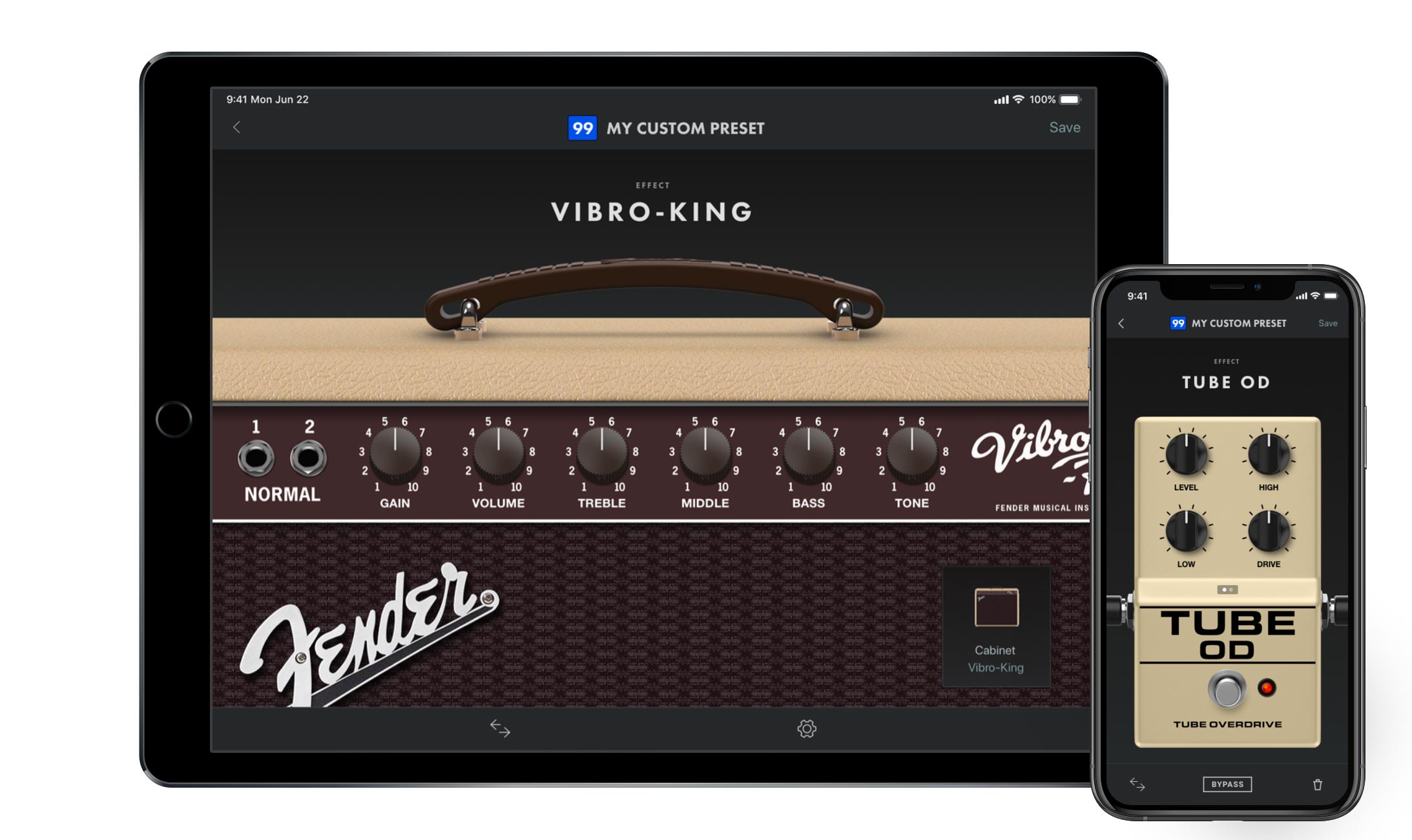
Fender Tone / Fender Tone amp controller
Design Director:
Andrew SelesDesigners:
Bill Salvador, Hsin ChenDesign Deliverables:
Requirements, User Stories, Flows, Wireframes, Mock-ups, Prototypes, Design QAAbout
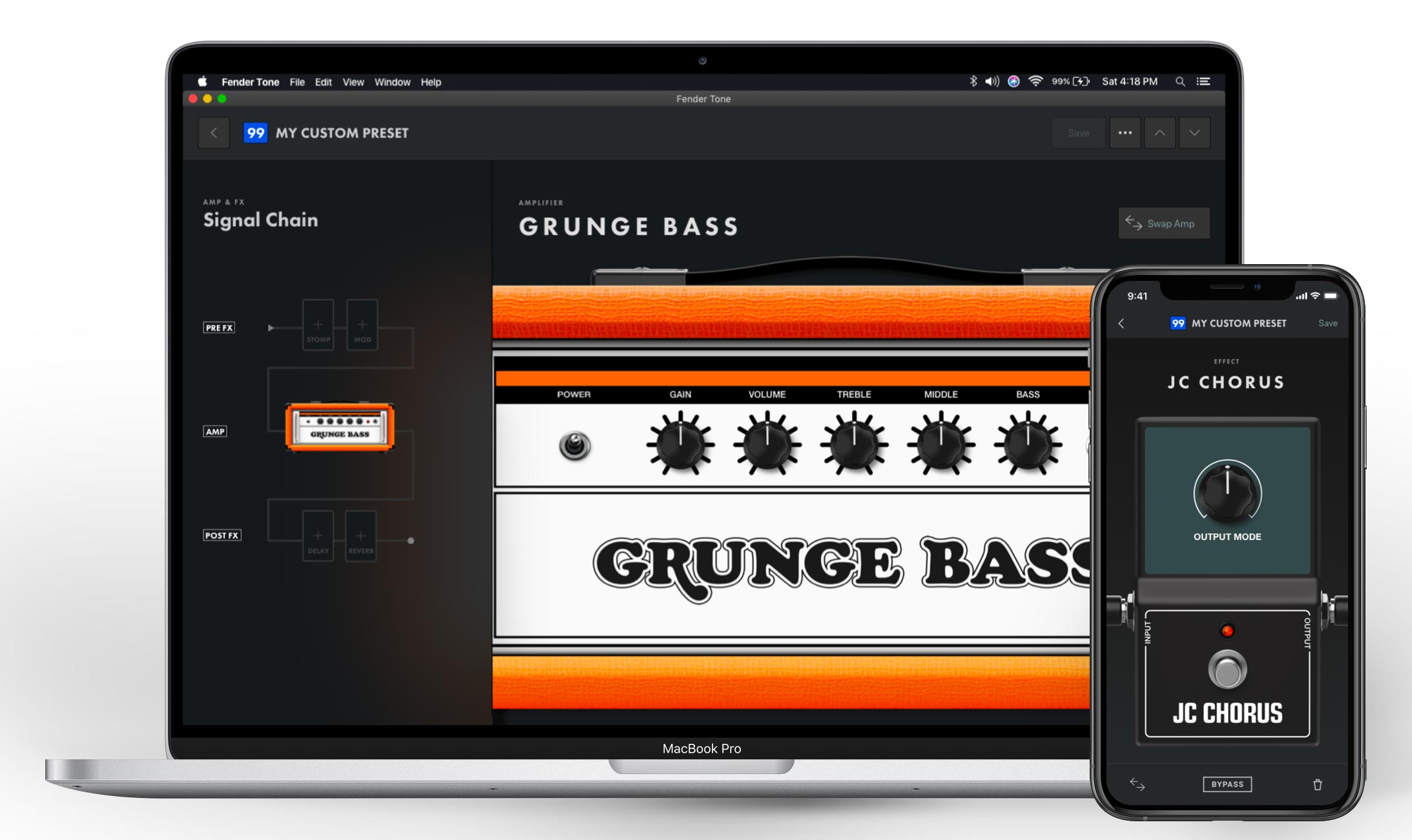
Fender Tone is a companion app for Fender’s line of Mustang GT/GTX/LT and Rumble Studio/Stage/LT amplifiers, available on iOS, Android, MacOS and Windows.
The app allows users to control their amp from their mobile device and desktop computer, managing, downloading, editing and creating presets. The app unlocks the true power of the amp, providing an intuitive interface layer for functions which are otherwise cumbersome from the amplifier’s onboard interface.
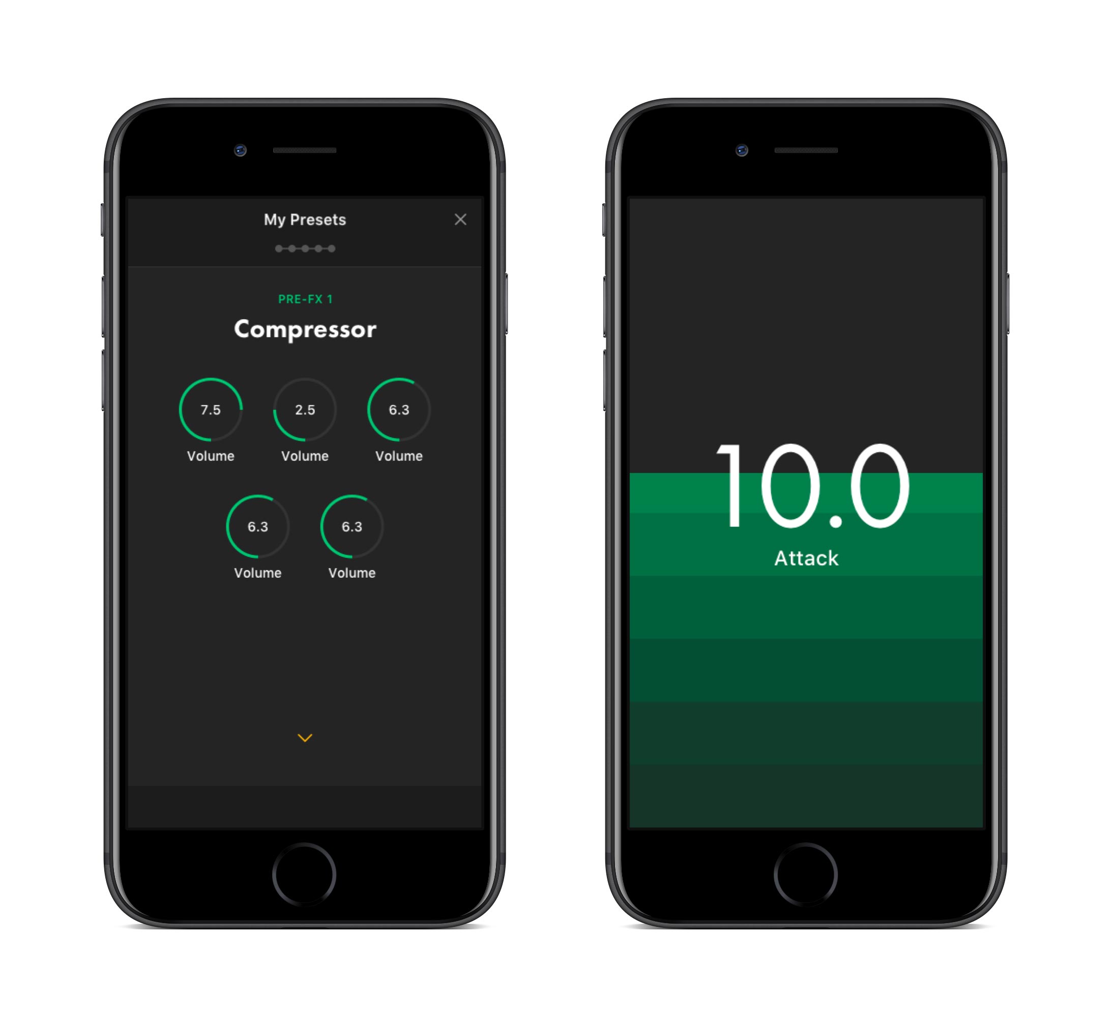
The first generation of Fender Tone sported a minimalist UI that was born, in part, out of necessity. The app would be the first amp controller for Fender to be native to iOS and Android. The design team focused on nailing the fundamental interactions. Rather than translating the amplifier’s onboard UI one-for-one to a touch device, we reimagined the interaction model, opting to focus on mobile and touch-device design patterns that would be familiar and intuitive to users. We chose to leverage existing iOS and Android UI patterns for common actions like editing and saving, while nailing down less common patterns like adjusting parameters via knobs which are often fraught with usability pitfalls. For example, how does one turn a knob on a touch screen? We decided to keep those interactions simple, limiting them to movement on the y-axis and providing redundant, higher resolution methods via full screen parameter adjustments.
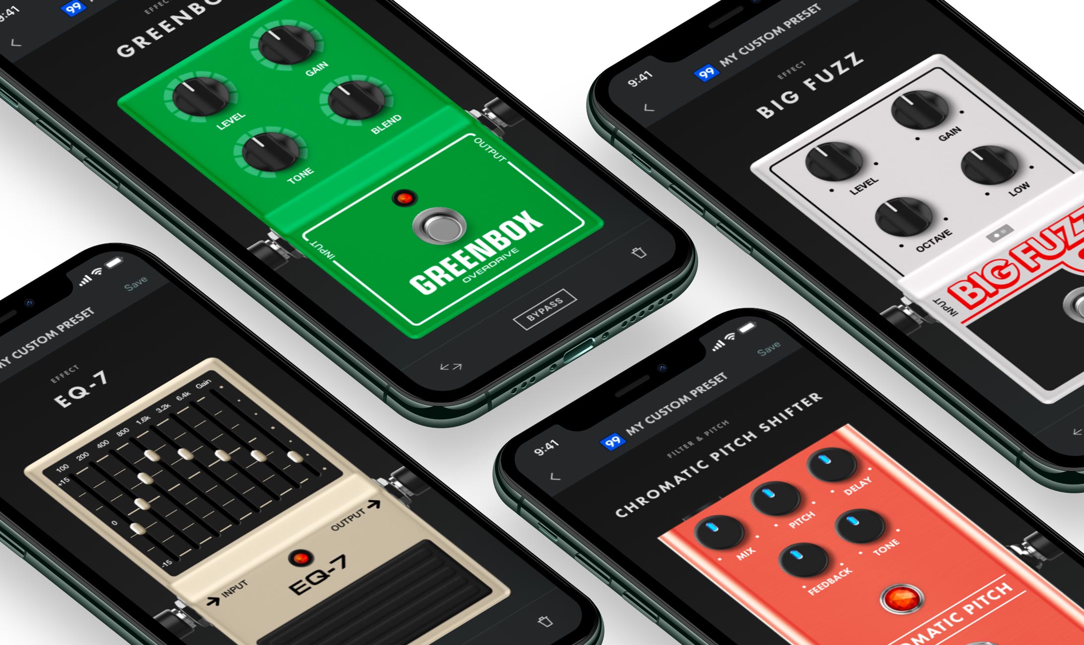
The next generation of the Tone app built upon the solid foundation of the first version, maintaining the UX patterns, while adding a rich skeuomorphic UI layer on top of the original UI. All of Fender’s rich physical product vernacular, the textures and materials, was leveraged to create a UI the was as evocative of the brand history as the vintage tones each amp model creates.
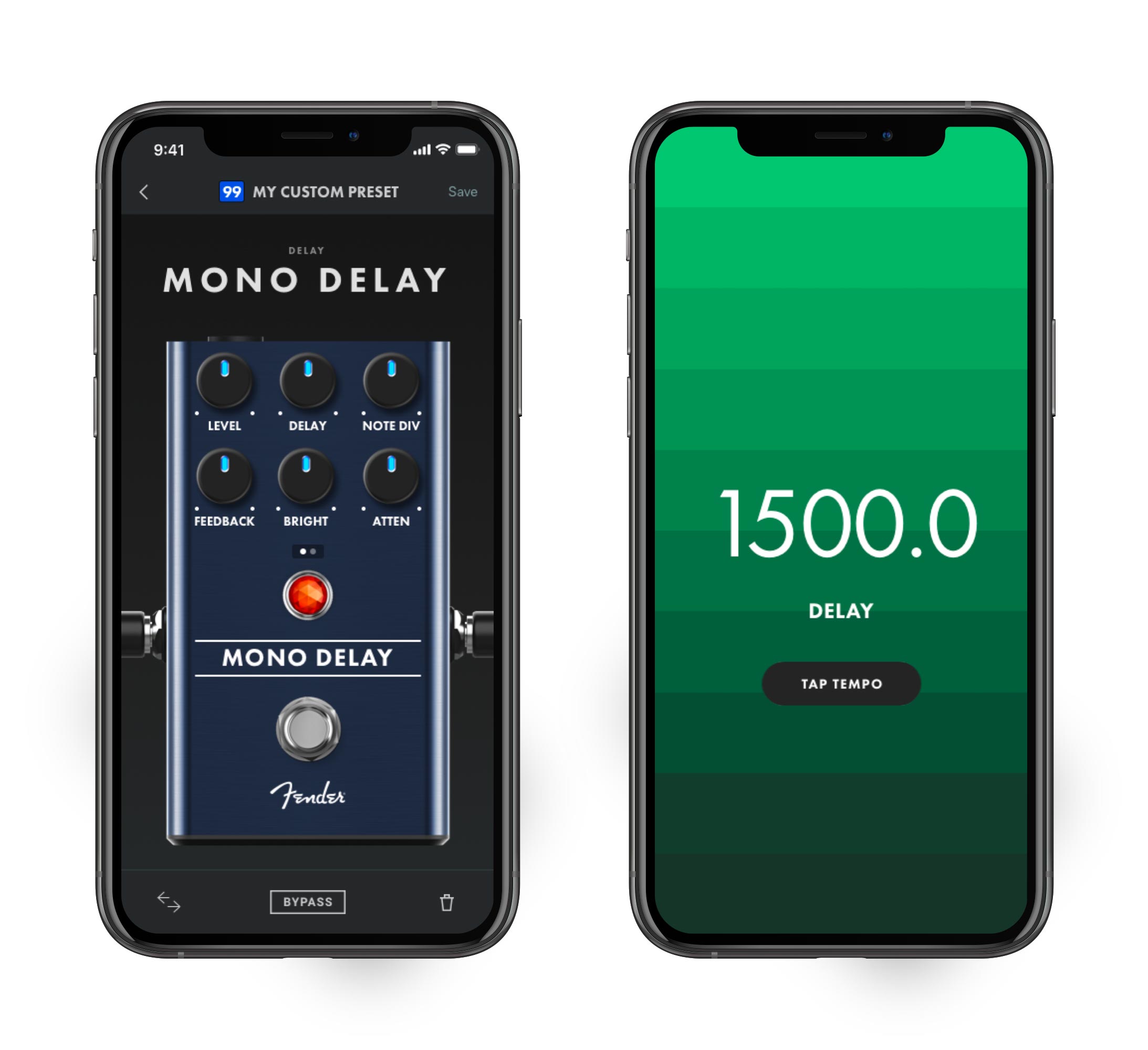
In all, over a hundred amps and pedals were created, covering all the quintessential effects and tones a guitarist needs.
For a more complete picture of all the amps, effects and details of the UI/UX, check out Fender Tone in the Fender Design System.

